Clinician schedule management
Providing clinical & operational oversight of schedules
Objective
To optimise the experience related to appointment management, cancellation, and rescheduling for clinical operations and support staff across US, CA, and UK teams.
Client Babylon
Team Product Designer, Product Manager, User Researcher, Delivery Manager, Front-end Engineer, Back-end Engineer, and QA Engineer.
Duration 6 weeks (3 Sprints)
Tools Figma, Miro, Looker, Jira
Context & Challenges
User Groups
Clinician Operations and Support Staff: Digital Patient Contact Staff, Clinical Liaison Staff, Calls Staff, Front of House Staff.
Clinician Operations and Support Staff: Digital Patient Contact Staff, Clinical Liaison Staff, Calls Staff, Front of House Staff.
Pre-existing Pages
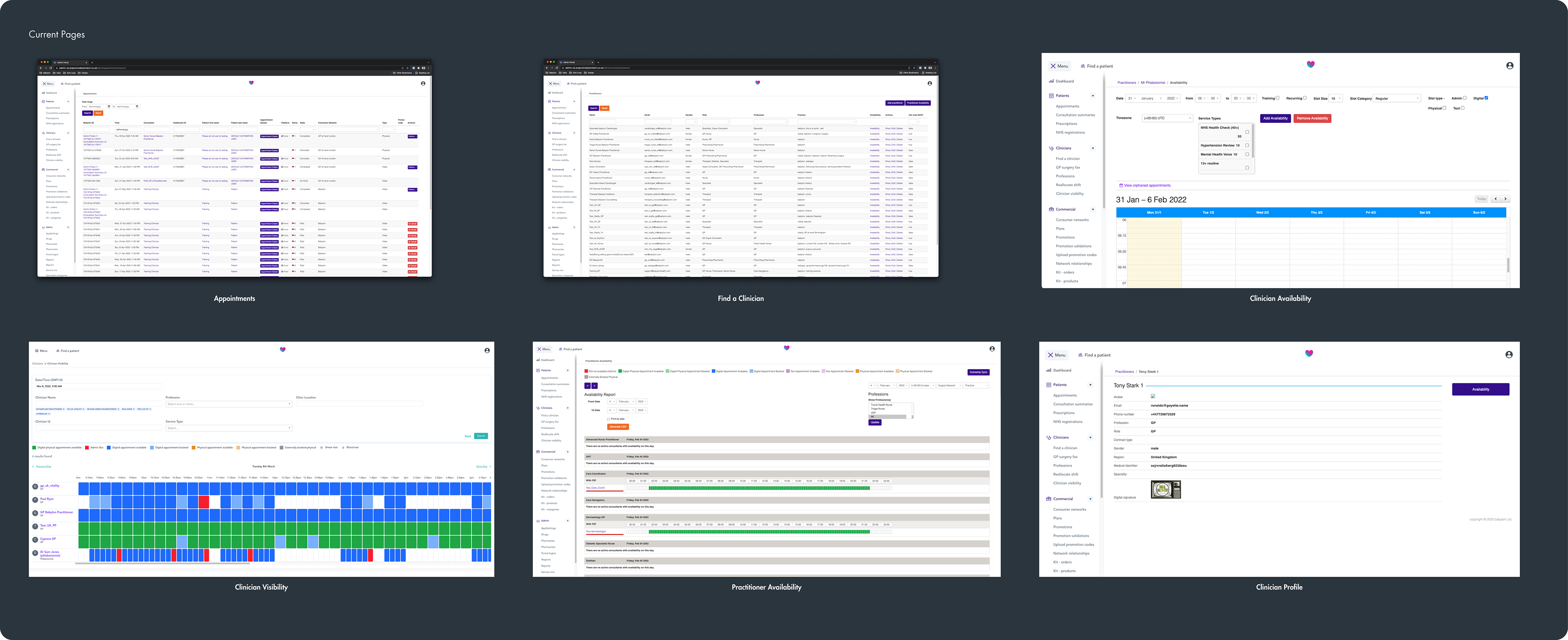
There were 6 pages: Appointments, Find a Clinician, Clinician Availability, Clinician Visibility, Practitioner Availability, Clinician Profile.
There were 6 pages: Appointments, Find a Clinician, Clinician Availability, Clinician Visibility, Practitioner Availability, Clinician Profile.
Issues
Slow loading times (+18 Sec), overlapping information, cluttered interface, use of unmaintained Core Ruby framework, and inclusion of irrelevant information for different regions.
Slow loading times (+18 Sec), overlapping information, cluttered interface, use of unmaintained Core Ruby framework, and inclusion of irrelevant information for different regions.


Research & Discovery
Quantitative Research
Analysed available data through Looker exploring user groups, page views, viewport size, and page entrance/exit metrics.
Analysed available data through Looker exploring user groups, page views, viewport size, and page entrance/exit metrics.
Functional Audit
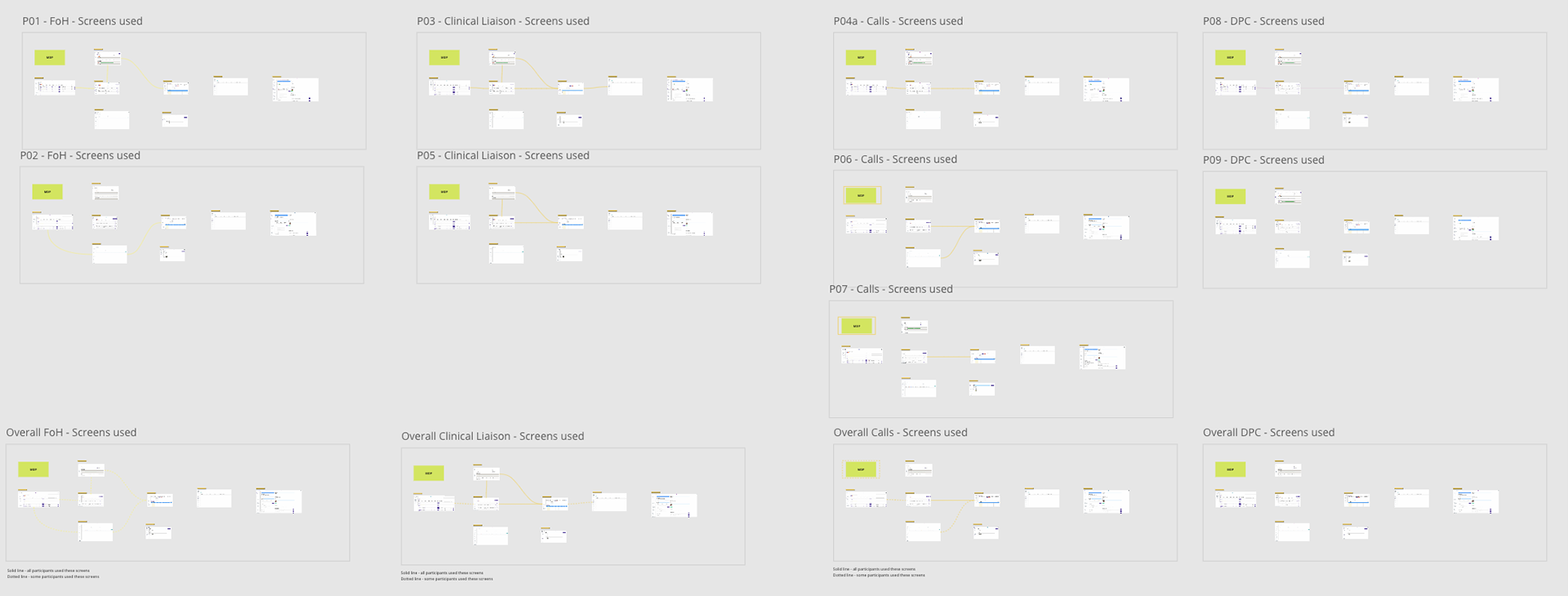
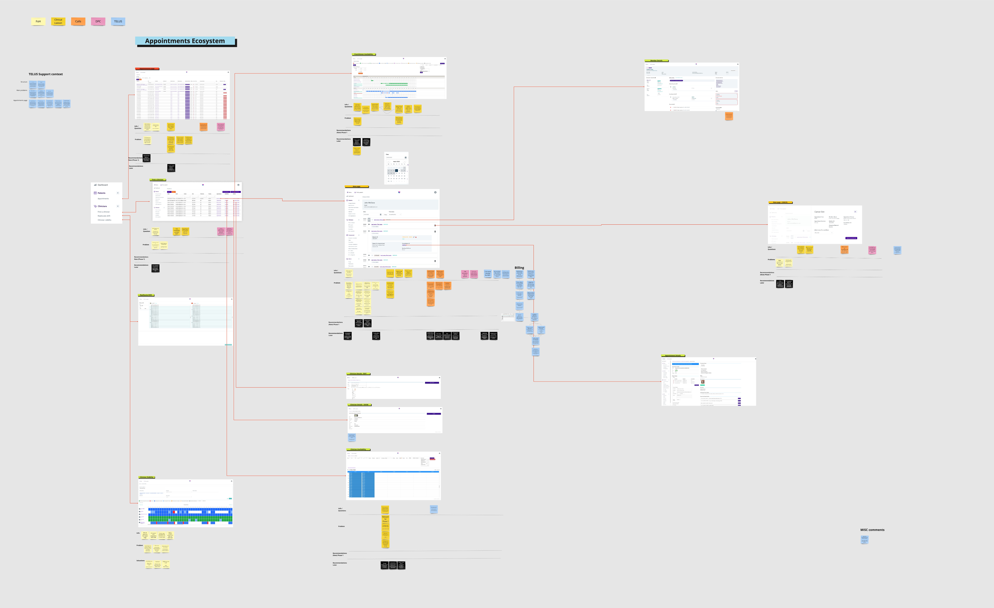
Completed a comprehensive audit, documenting functionality and data across all pages, and mapping navigation and usage patterns.
Completed a comprehensive audit, documenting functionality and data across all pages, and mapping navigation and usage patterns.
Technical Spikes
Engineers investigated technical constraints and data access related to the existing pages.
Engineers investigated technical constraints and data access related to the existing pages.
User Interviews
Collaborating with the User Researcher, we conducted interviews with the user groups to understand their use of existing pages. These sessions, also attended by the Product Manager and occasionally Engineers, were structured around a jointly-prepared script. We set up a direct Slack channel for on-the-spot questions during these interviews
Collaborating with the User Researcher, we conducted interviews with the user groups to understand their use of existing pages. These sessions, also attended by the Product Manager and occasionally Engineers, were structured around a jointly-prepared script. We set up a direct Slack channel for on-the-spot questions during these interviews
Key Insights:
+ Various user groups navigated different ways to access identical pages or information.
+ UK-based Front of House staff faced unique challenges, like managing several clinician schedules.
+ US and CA staff encountered time zone issues due to geographical variances from their clinicians.
+ Tasks related to appointments exhibited a range of complexities, from simple to bulk rescheduling and cancellations.


Design & Prototyping
How Might We
Generated and grouped HMW questions into several categories: Clinician Details, Time/Date Selection, Clinician Schedule, etc.
Generated and grouped HMW questions into several categories: Clinician Details, Time/Date Selection, Clinician Schedule, etc.
Implementation Plan
Due to the scope of this work and I worked with the Product Manager to prioritise the work and I generated a board to track our backlog and what was included in each phase. Phase one was about getting the initial schedule displayed and being able to cancel appointments.
Due to the scope of this work and I worked with the Product Manager to prioritise the work and I generated a board to track our backlog and what was included in each phase. Phase one was about getting the initial schedule displayed and being able to cancel appointments.
Key User Flow [Phase one]
A user opens the Find a Clinician page. Finds the Clinician which they wanted to view the schedule for. Opening the new Clinician Schedule page, views all the booked and completed appointments. Finally select an appointment which isn’t completed and cancels the appointment providing a reason for cancellation.
A user opens the Find a Clinician page. Finds the Clinician which they wanted to view the schedule for. Opening the new Clinician Schedule page, views all the booked and completed appointments. Finally select an appointment which isn’t completed and cancels the appointment providing a reason for cancellation.
Ideation
Digitally and in sketches to ideate solutions, reviewing and iterating in collaboration with the Product Manager.
Digitally and in sketches to ideate solutions, reviewing and iterating in collaboration with the Product Manager.
Wireframing and High-fidelity Design
Moved from Miro for initial wireframes to Figma for more detailed, high-fidelity designs.
Moved from Miro for initial wireframes to Figma for more detailed, high-fidelity designs.
Prototyping
Created a high-level Figma prototype focusing on a key user flow for phase one.
Created a high-level Figma prototype focusing on a key user flow for phase one.
"How Might We" Categories
Design Decisions
Visual Design Alignment
Ensured component alignment with existing design elements across the company’s various portal applications due to the absence of an established design system.
Ensured component alignment with existing design elements across the company’s various portal applications due to the absence of an established design system.
Component Synchronicity
Collaborated with the designer from the Clinical Portal to ensure uniformity in how appointment details were displayed across platforms.
Collaborated with the designer from the Clinical Portal to ensure uniformity in how appointment details were displayed across platforms.
Clinical Portal components review
Early stage user flow
Appointment Cancel panel
Bulk Rescheduling exploration
Usability Testing
Usability Test Setup
Conducted a second round of user research focusing on usability testing with the new designs.
Conducted a second round of user research focusing on usability testing with the new designs.
Key Findings: Generally positive feedback with noted areas for improvement, such as the necessity for additional fields on the 'Find a Clinician' page and visibility for timed-out appointments.


Implementation & Iteration
Phase 1 Implementation
Working with the PM, we broke down the Phase 1 designs into tickets in Jira for the Engineering team. In the Sprint refinement meetings we reviewed the tickets with the engineers and aligned on what was needed. Designs were annotated, but I also worked closely with each engineer as they picked up the ticket. Once tickets were complete I would do a Design QA review.
Working with the PM, we broke down the Phase 1 designs into tickets in Jira for the Engineering team. In the Sprint refinement meetings we reviewed the tickets with the engineers and aligned on what was needed. Designs were annotated, but I also worked closely with each engineer as they picked up the ticket. Once tickets were complete I would do a Design QA review.
Phase 2 and Quick Follows
As there were a number of features that we didn’t include in Phase one, we went straight into Phase two with quick follows. Phase two included expanding the schedule to show Available and Admin Slots.
As there were a number of features that we didn’t include in Phase one, we went straight into Phase two with quick follows. Phase two included expanding the schedule to show Available and Admin Slots.
Features like the rescheduling and bulk management of appointments were pushed back into later phases.
Results & Learnings
The new Appointment Management page enabled users to view booked appointments in under 3 seconds, significantly improving from the previous 18 seconds.
The removal of the Appointments page and the addition of the new page moved users away from the other pages for nearly all tasks, as a result simplifying the user experience.
Clinician Operations and Support Staff were able to effectively navigate and perform necessary functions, such as viewing clinician schedules and managing appointment cancellations
Collaboration across cross-functional teams, especially with engineers during the ticketing phase, was instrumental in ensuring that the final product aligned with design intentions.
